Web development technology is fast moving and constantly evolving and seems every time you blink, some new framework has been created. In this article I’ll focus on getting started with React Flexbox Grid. Note that this is not a full fledged tutorial nor a description of flexbox; if that’s what you are looking for then you should check out Chris Coyier’s fantastic write-up: A Complete Guid to Flexbox. The goal of this article is to allow you to quickly get up to speed with react-flexbox-grid and then explore more on your own, or join the RedBit team and we’ll help you!
The code for this tutorial can be found here, while a working copy of the final result can be found here.
Introduction
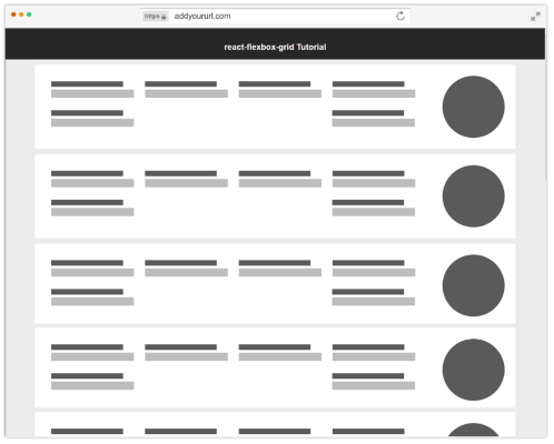
If you’ve been a front end developer for any time at all on a team with a designer, you’ve inevitably been handed an image like the one below and told to make it come to life for the web.
Easy, right? … a couple floats here, maybe a media query here and there… and soon you’ve got a few hundred lines of css, thinking: there has to be an easier way.
Well, if you’re already using react, there is…
react-flexbox-grid
From the react-flexbox-grid site, the library is described as “a set of React components that implement flexboxgrid.css” In this tutorial, we will use this library to implement the example design above.
Coding the Design
To help things along, I’ve created two sample components for us to place around the screen for different screen sizes:
Field:

Hero:

Understanding the Basics
When using react-flexbox-grid, you will deal with three components:
Grid: The base component that will wrap everything else.
Row: Rows within the grid.
Col: Columns within the grid.
The simplest example would be a one row, one column grid:
Column Sizing
In this (overly) simple example, notice the attribute on the Col element: xs={12}. This determines how many columns (out of twelve) that this column should take up on extra small (xs) screens. The four supported screen sizes are:
lg – 75em (most often 1200px) and up
md – 64em (most often 1024px) to 74em
sm – 48em (most often 768px) to 63em
xs – up to 47em
Mobile First
While this may come across as a bit of a buzz phrase, we will be starting with mobile and moving our way up. Due to the way that the library is written (and more specifically the way that media queries are based on a minimum width), starting with desktop will cause nothing but headaches.
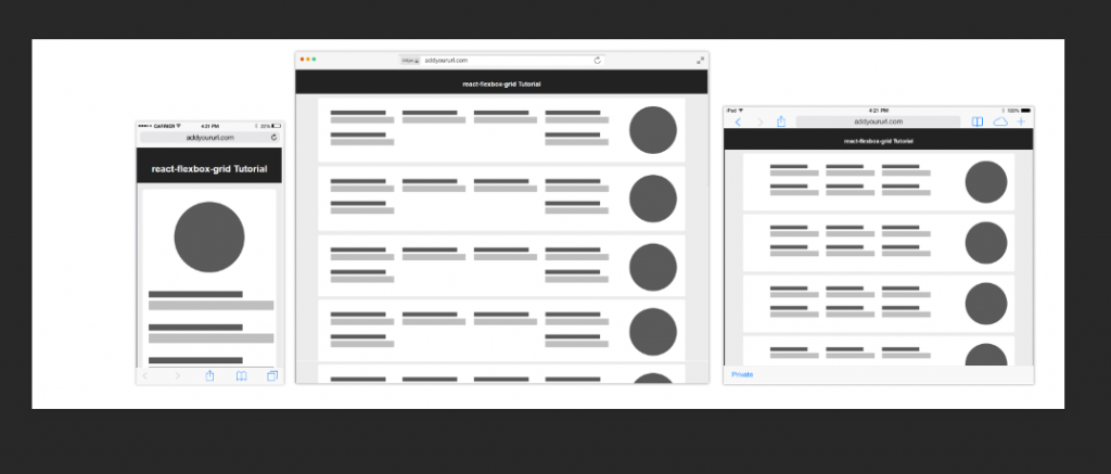
So given that, let’s finally get down to coding, beginning with the mobile page.
The code for the mobile page is actually quite simple: we wrap each Card in a Row component, then wrap the Hero and six Field components in Col components. Since we are only dealing with mobile, we can set only the xs attribute and be on our way. The code would look like this:
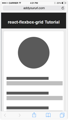
Tablet Size
Notice that the code in the previous section does not respond to different screen sizes at all, indicating that the layout will be of terrible quality on larger displays. We’ll update the code to match the design for Tablet-sized screens first. Looking at the design, the fields should be arranged in two rows of three columns, with the Hero component off to the right.
Since we are dealing with a 12 column grid, we should be able to set the column size to 4 (12/3 = 4) and it the library will take care of the rest for the fields.
If you run it now, you’ll notice that we didn’t handle the hero image. In order to do this, we will have to nest the Rows and Cols. Let’s divide the Card into two sections, one for the Hero component and one for the rows of Field components. The resulting code should look like this:
While this looks much closer to the design, you should notice a visual bug right away, the Hero Image is on the wrong side. We could fix the issue by simply moving the image to the end of the parent row… but then the Hero would be at the bottom of the mobile view.
Reordering attributes to the rescue!
react-flexbox-grid has more than the basic column width attributes to help with your layout needs. The one that we’ll use here is Reordering. What this feature allows us to do is specify that the first column of the parent row should be first on mobile, but last for all other page sizes. Unsurprisingly, these attributes are named first and last, respectively. The updated code should look like this:
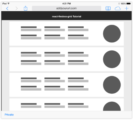
Desktop
Finally, let’s implement the layout for Desktop. You’ll see that the only true difference is that we now have a row of four columns, with the second row containing two columns aligned with the first and last columns in the first row:
First we’ll update the Field rows to use three as the value for lg (12/4=3). While the first row properly has the four Field components lined up, notice that the second row’s columns are aligned incorrectly per our design.
Another feature of react-flexbox-grid – distribution attributes – allows us to specify how to distribute the contents of a Row or Column within the available space. This, too, can be defined per screen size so that the layout on smaller displays is unaffected.
In our case we want to use the between attribute on the Row containing the Field components so that the final two (on the second row) are distributed with the superfluous screen real estate left between them. The final code should look like this:
Final Thoughts
We have only scratched the surface of what can be accomplished with react-flexbox-grid. To read more, check out the GitHub repos for both react-flexbox-grid and the underlyling css framework: flexboxgrid.css.
.png)


