
In this post, I'll give a short demonstration of how small viewport units in CSS can be used to build a grid that keeps a certain number of elements above the fold on all devices.
Introduction to Viewport Units
Let's begin with a quick primer on CSS viewport units. You may already be familiar with the 'vh' and 'vw' units, which have been around for a while and have broad browser support. These units specify dimensions as a percentage of the viewport height ('vh') or width ('vw'). These are distinct from percentage ('%') units, which specify an element's dimensions as a percentage of one of its ancestor's dimensions. For example, '100vh' is 100% of the viewport height while '5vw' is 5% of the viewport width. There are additional units like 'vmin' and 'vmax', which express dimensions as a percentage of the minimum and maximum viewport size, respectively. For example, '50vmax' will be equal to '50vh' in portrait orientation or '50vw' in landscape orientation.
The trouble with 'wh' and 'vw' is that the full dimensions of the viewport aren't always available to your application, especially on mobile devices. Browser controls like the location bar will occupy some of that space at least some of the time, which means that an element whose height is '100vh' will overflow the available space and some of its content will be hidden when the browser controls are visible. There is a good explanation of this problem at web.dev.
If you're trying to keep certain content above the fold, you can’t reliably use '100vh' as an indicator of how much space will be available before the user has to scroll. You also can’t reliably predict the amount of space that will be occupied by browser controls because it varies by operating system and browser. (Otherwise you could probably get away with a rule like 'height: calc(100vh - <location bar height in px>)', but please don't do that. It's an invitation to have your site broken by a future OS or browser update.)
This problem can be solved by taking advantage of three new types of units:
- The small viewport ('svh'/'svw'/'svmin'/'svmax'): These units give you the height, width, minimum dimension and maximum dimension of the viewport when the browser chrome is visible (e.g. on page load or after scrolling to the top of the page).
- The large viewport ('lvh'/'lvw'/'lvmin'/'lvmax'): These units give you the height, width, minimum dimension and maximum dimension of the viewport when the browser chrome is hidden (e.g. after scrolling down the page).
- The dynamic viewport ('dvh'/'dvw'/'dvmin'/'dvmax'): These units give you the small or large viewport dynamically, depending on whether the browser chrome is currently visible.
These units are relatively new to CSS but have, at the time of writing, been implemented in Chrome, Edge, Firefox and Safari. You can check the current support for this feature on caniuse. (This link is for dynamic viewport units, but browser support should be the same for the small and large viewport units.) If you need to support older browsers that haven't implemented these units, consider using fallback rules. This strategy will allow you to provide the best experience for newer browsers at the cost of delivering a less optimal (but still good) experience on older browsers.
The Grid Layout
HTML
The HTML for this demo is about as simple as it gets — an unordered list that contains twelve items, each of which contains a number.
index.html
CSS
The stylesheet does all the work of rendering the list as a grid and setting the size of the items so that a certain number of rows will be visible without scrolling. Before you continue, it will help to be familiar with custom properties, the 'calc' function and CSS grid.
styles.css
We start by defining several custom properties. These aren't absolutely necessary, but they will help keep the CSS rules clean and readable.
- The '--page-height' property is set to 100% of the small viewport height. (To reiterate, the small viewport encompasses all the space available to your application when the browser chrome is visible.)
- The '--gap-size' property represents the size of the gutters between grid items and the padding around the grid container. In this example, '--gap-size' is set to 1% of the small viewport height, but it could have any value and use any units. If you want gutters to be '20px' or '1rem' on all devices, you're free to do so.
The grid properties are defined separately for portrait and landscape orientation:
- '--column-count-portrait'/'--column-count-landscape': The number of columns we want in the grid.
- '--row-count-portrait'/'--row-count-landscape': The number of rows we want to render above the fold. The actual number of rows in the grid is determined by the html.
- '--gap-height-portrait'/'--gap-height-landscape': The sum of all the gaps between rows that we want to render above the fold. The number of gaps will be one more than the number of rows. If we want three rows above the fold, there will be four gaps including the top and bottom.
- '--content-height-portrait'/'--content-height-landscape': The total height available for content, calculated by subtracting the total gap height from the page height.
- '--row-height-portrait'/'--row-height-landscape': The row height, calculated by dividing the total content height by the number of rows we want to render above the fold.
Next, we use the custom properties in our CSS rules:
- The 'html, body' rule is a simple reset to make sure the browser doesn’t apply default padding or margins that would affect the layout. (You might already have a reset like this in your stylesheet, in which case you might not need this.)
The 'ul.svh-grid' rule unsets the default list styles and sets 'display: grid' to enable CSS grid layout. 'grid-template-columns' is set to render the list items in equal-width columns, with the number of columns defined by '--column-count-portrait'. 'grid-auto-rows' is set to render as many rows as necessary, with the row height defined by '--row-height-portrait'. The grid’s gap and padding are set to the value of the '--gap-size' property. The margin is set to zero to remove any default margins that the browser might apply to the 'ul' element.
The 'ul.svh-grid > li' rule applies to the individual items in the grid. These styles affect the appearance of the list items and have no impact on the grid layout. Notice that the font size for the numbers is set using the 'vmax' unit. This makes the font size 10% of the maximum viewport dimension, which is the same in both portrait and landscape orientation. This is a simple way to set the font size proportionally to the viewport without having it shift on orientation change.
Finally, we use a media query to override the grid styles in landscape orientation:
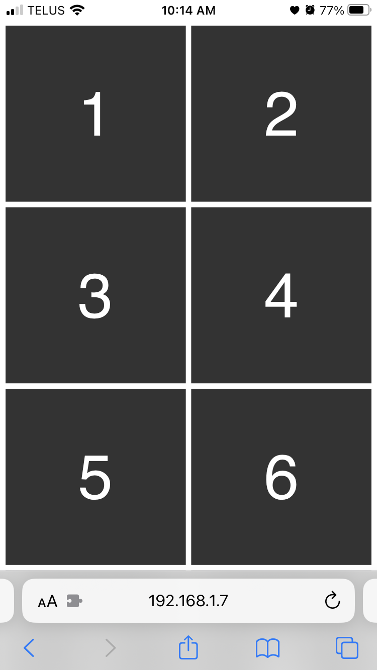
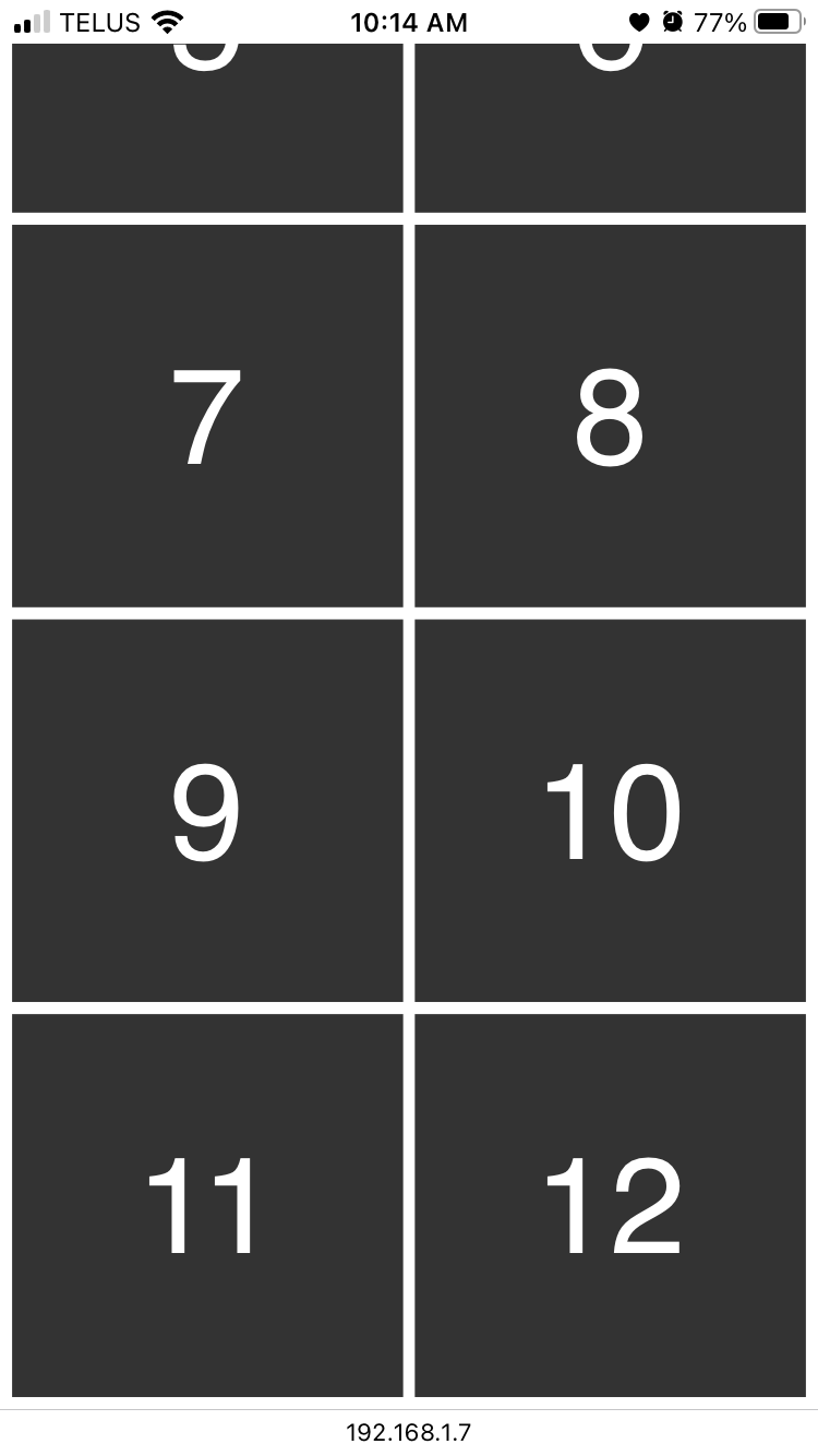
In portrait orientation, these styles give us a two column layout where three rows appear above the fold.
On page load or when scrolled to the top of the page:
When scrolled to the bottom of the page:
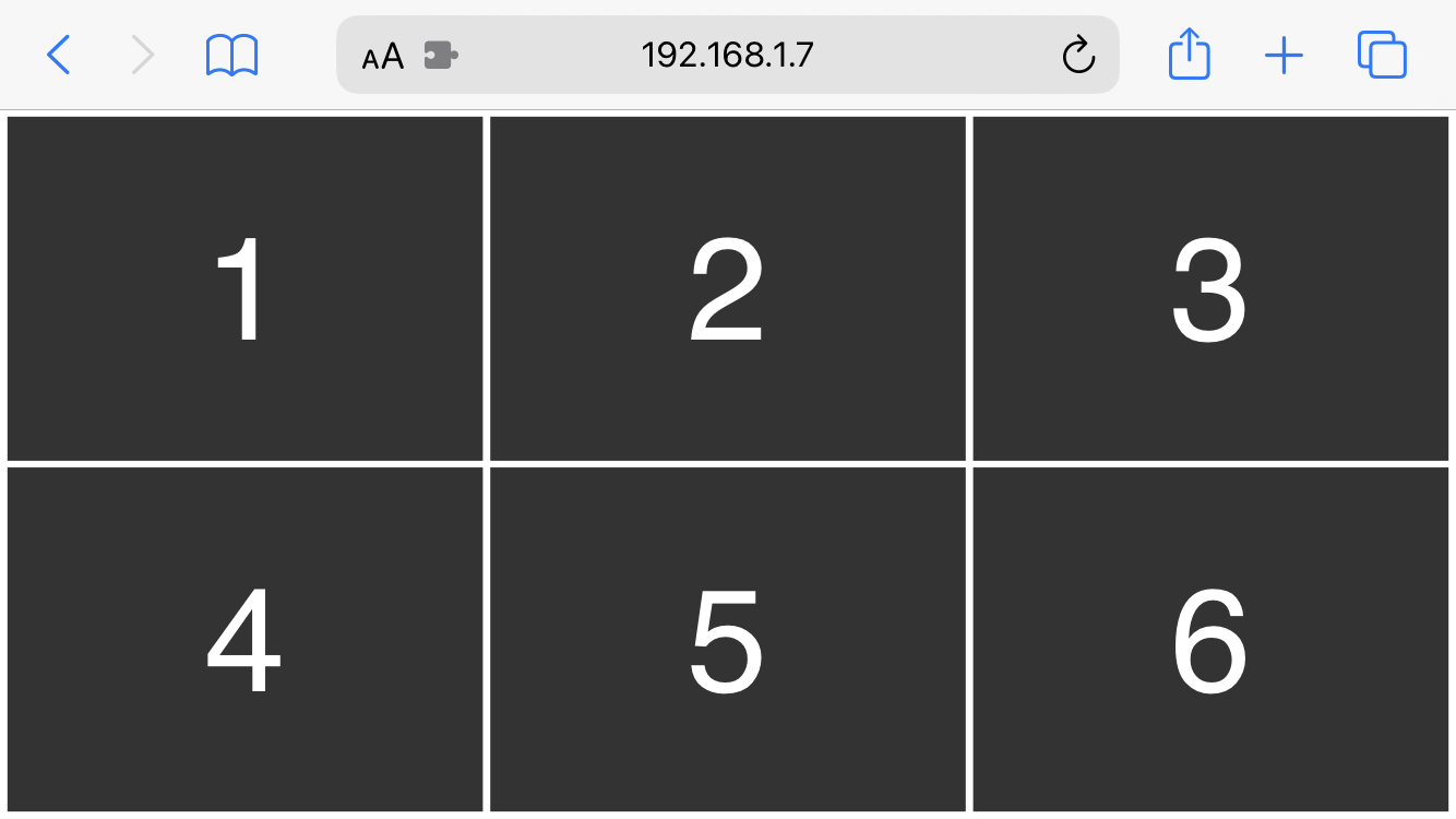
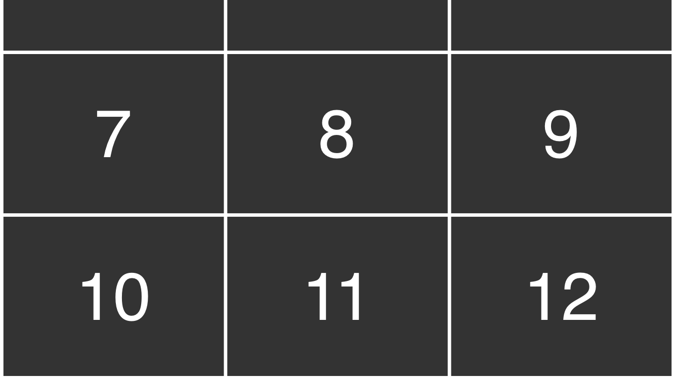
In landscape orientation, these styles give us a three column layout where two rows appear above the fold:
On page load or when scrolled to the top of the page:
When scrolled to the bottom of the page:
Why Not Use the Dynamic Viewport?
You might wonder why we didn't use the dynamic viewport height ('dvh') instead of the small viewport, which would have allowed us to optimize the size of the grid items to the height of the viewport regardless of whether or not the browser chrome is visible. As soon as the user scrolls down the page, the browser chrome transitions offscreen and the dynamic viewport compensates by switching from the small viewport to the large viewport. If the layout is based on the dynamic viewport, the grid items will increase in height when that transition occurs. In addition to that problem, the CSS specification doesn’t require that the viewport transition animates at a full 60fps, likely because that would be computationally expensive in many scenarios. Some browsers perform the transition quite abruptly which causes a visible shift in the layout. In this case, using the small viewport height produces a more natural feeling result when scrolling. The behaviour will vary depending on the OS, browser and individual use cases, though, so experiment with the different viewports to find what works best for you. (If you want to see how the dynamic viewport works in this scenario, simply change the '--page-height' property to '1dvh'.)
.png)


